
How I work
Ingenico B2B digital campaign
I’d love to take this opportunity to show you how I like to work during a project. This is a typical example of my process and how I like to lead a campaign. The highs, the lows and everything in between.
The brief
To deliver a sharp, focused and engaging go-to-market campaign targeting the digital goods and services market.
Target audience: CFO, COO and payment manager decision makers working in e-streaming, e-learning, Exaas and onlline gaming.
Step 1: interrogate the brief
The challenge
The digital companies we’re targeting are hyper-focused on customer experience, growth and loyalty - how can we convince them that to keep this customer retention and to grow their businesses, they need a reliable payment provider to ensure that the payments are approved every time.
Where can Ingenico add value?
After some client and competitor research, we realised that merchants need to know Ingenico can help them grow in this uncertain future. To make that possible, they need to trust Ingenico as their payments provider of choice - “we make sure the payment is approved.” This will inform the components of each concept: the future + trust.
Step 2: brainstorm
Creating a positive environment to empower the whole team to generate as many creative ideas as possible. A few questions we asked ourselves were:
How might we…
Emote trust using only imagery?
Tell an inspiring story in ten seconds?
What if…
We can only use colour?
We can only use words?

Step 3: initial ideas
Idea 1
Payments for the future
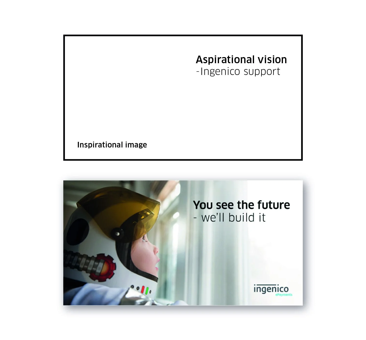
You see the future - we’ll build it
You find the opportunity - we’ll deliver it
You engage the customers - we’ll support them
Focusing on the innovative nature of digital service companies - they’re visionaries. By providing them with a comprehensive payments solution, Ingenico is helping them to realise that vision.
Imagery: Bold photography that focuses on vision and the future - e.g. a child dressed as a spaceman.
Idea 2
Louder, stronger, faster
Amplify your digital business:
Your e-learning business, but louder
Your gaming business, but stronger
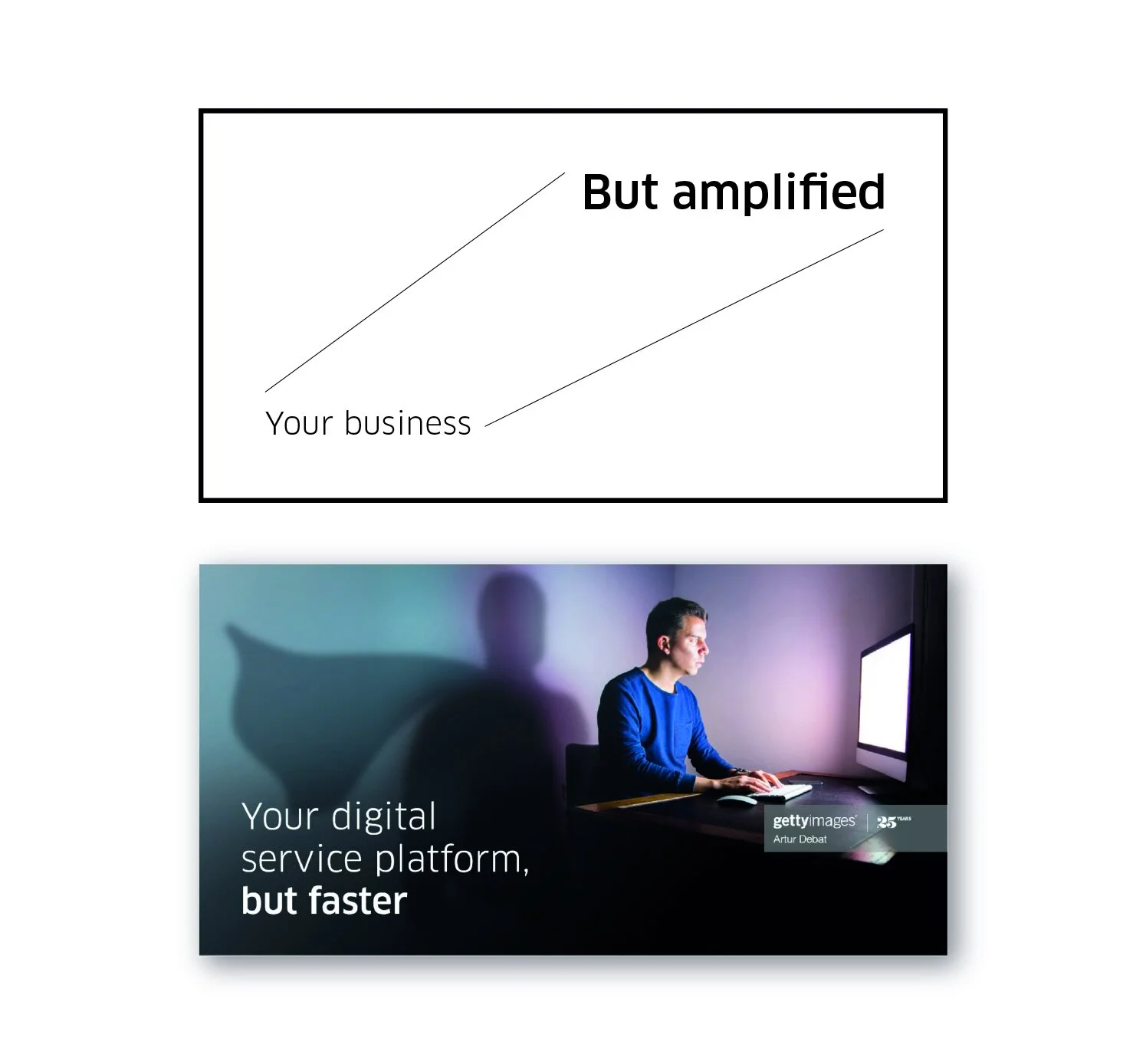
Your digital service platform, but faster
Post-pandemic, digital companies are faced - suddenly - with soaring demand for their services. In effect, this can feel like a ‘shadow business’ - a silhouette of what’s real. This direction is designed to show how Ingenico can make this growth a positive, measurable and meaningful one.
Imagery ideas: bright, bold, colourful silhouettes - amplified.
Idea 3
Virtually anywhere
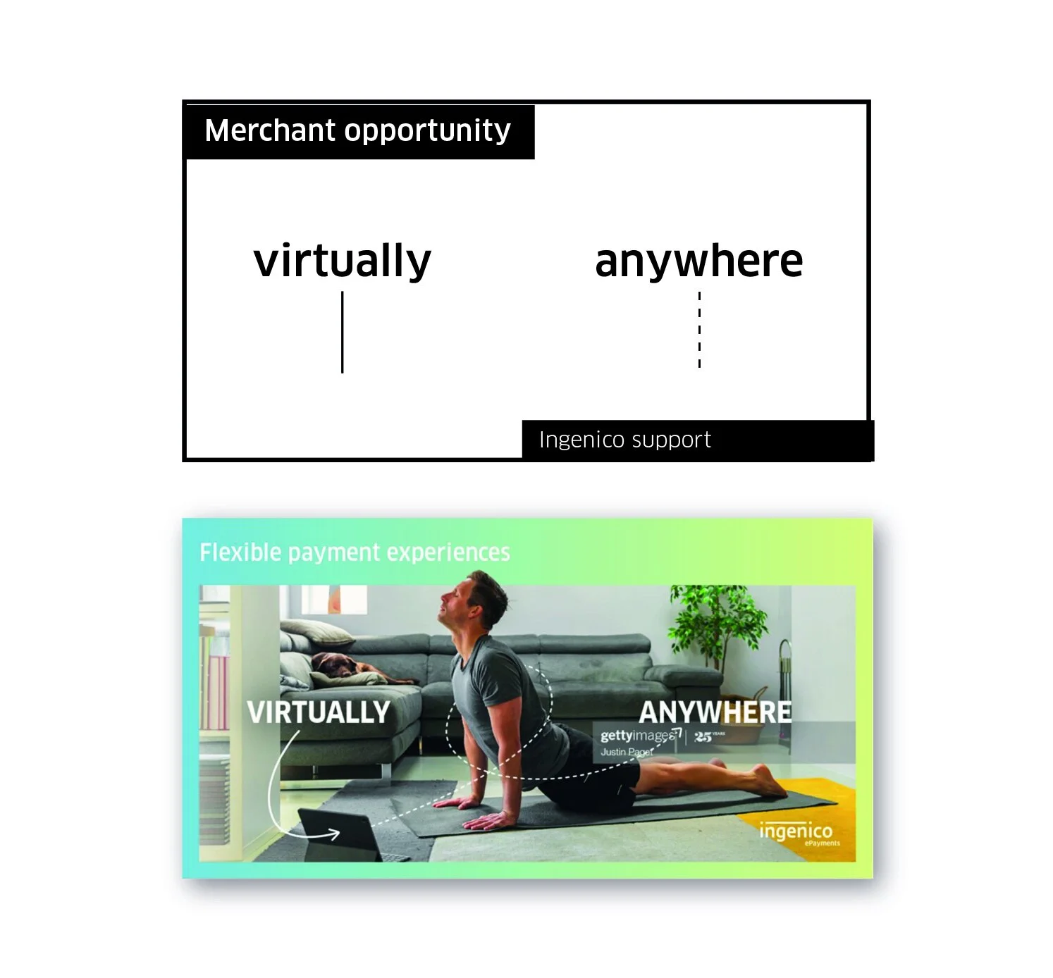
Unlock new experiences - virtually anywhere
This concept places the idea of digital services that are accessible - and available to purchase - virtually anywhere at it’s heart.
clean, simple imagery of customers enjoying digital services in their homes is amplified by bold background gradients that highlight the brightest colours in the images. The supporting copy is designed to speak directly to merchants - in this case ‘flexible payment experiences’. Wording has been chosen on each flashcard to align with the action of the customer in the image, and add a personal touch. The headlines are short and simple, with the ‘virtually anywhere’ tagline always level within the image
Imagery: Human-centred, realistic and relateable. With a doodle-style graphic element used as a visual device to connect the imagery with the ‘virtually anywhere’ message.
Time for some client feedback
“Love the focus of virtually anywhere, but can we make it work around this tagline - “peak payments conversion”. With bolder colours and more eye-catching images - so bright that my eyes hurt”
Step 4: Concept evolution
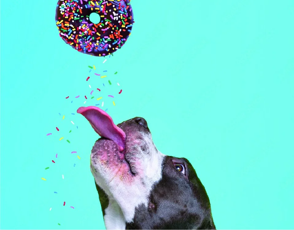
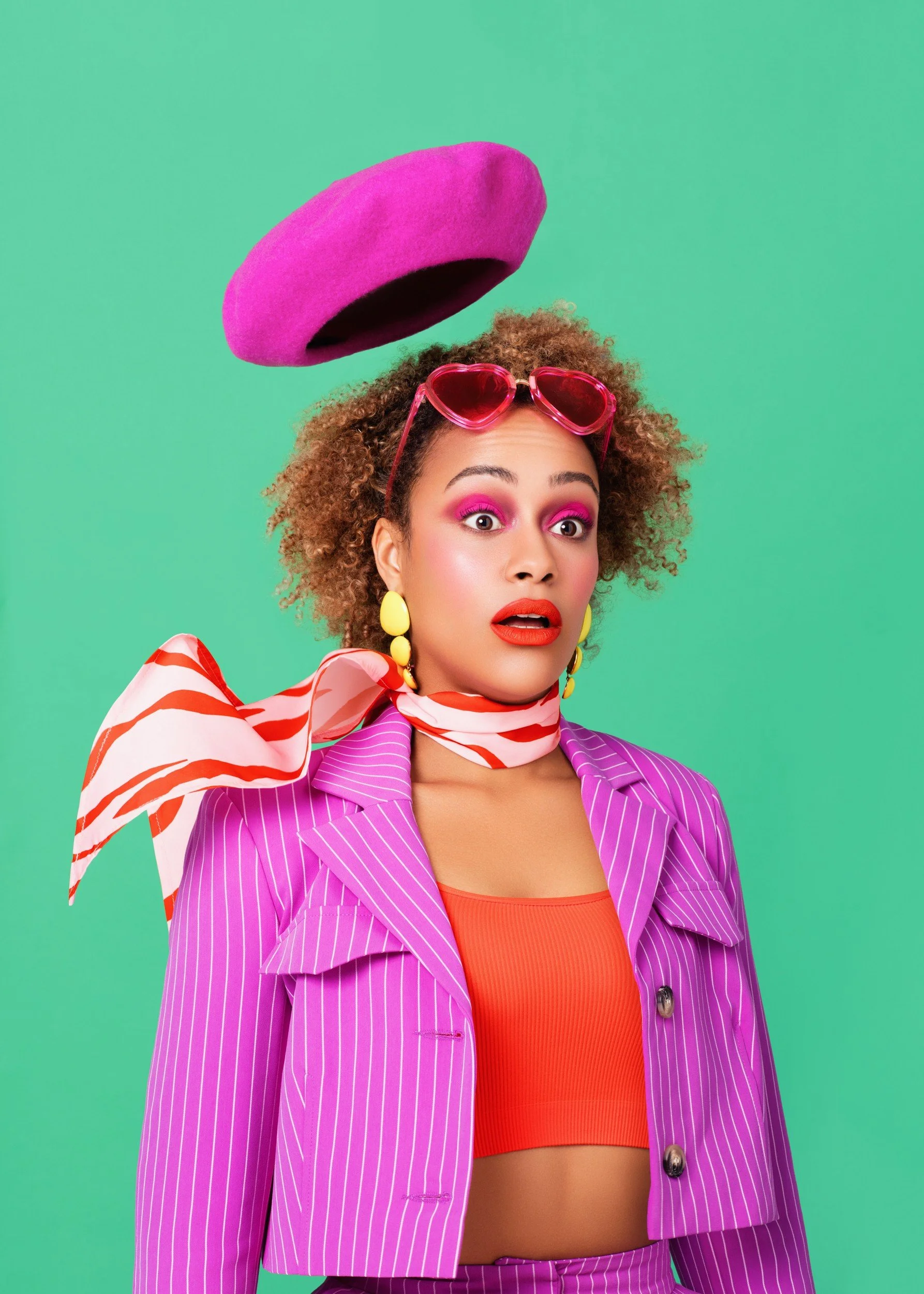
Moodboard theme: eye pain


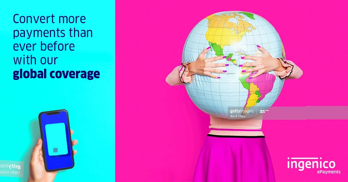
Route development
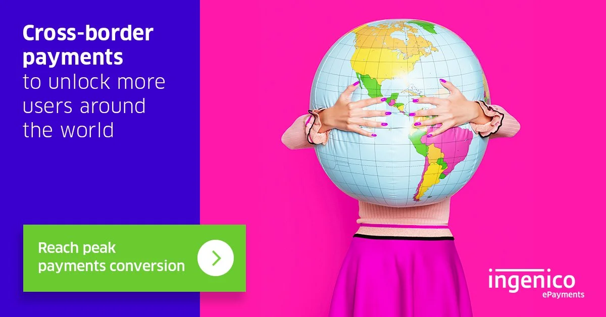
The client loved the image of the girl hugging the globe and wanted this to be the main image of the campaign. They also liked the tagline, “Reach your payment conversion peak by turning virtual classmates into lifetime learners”
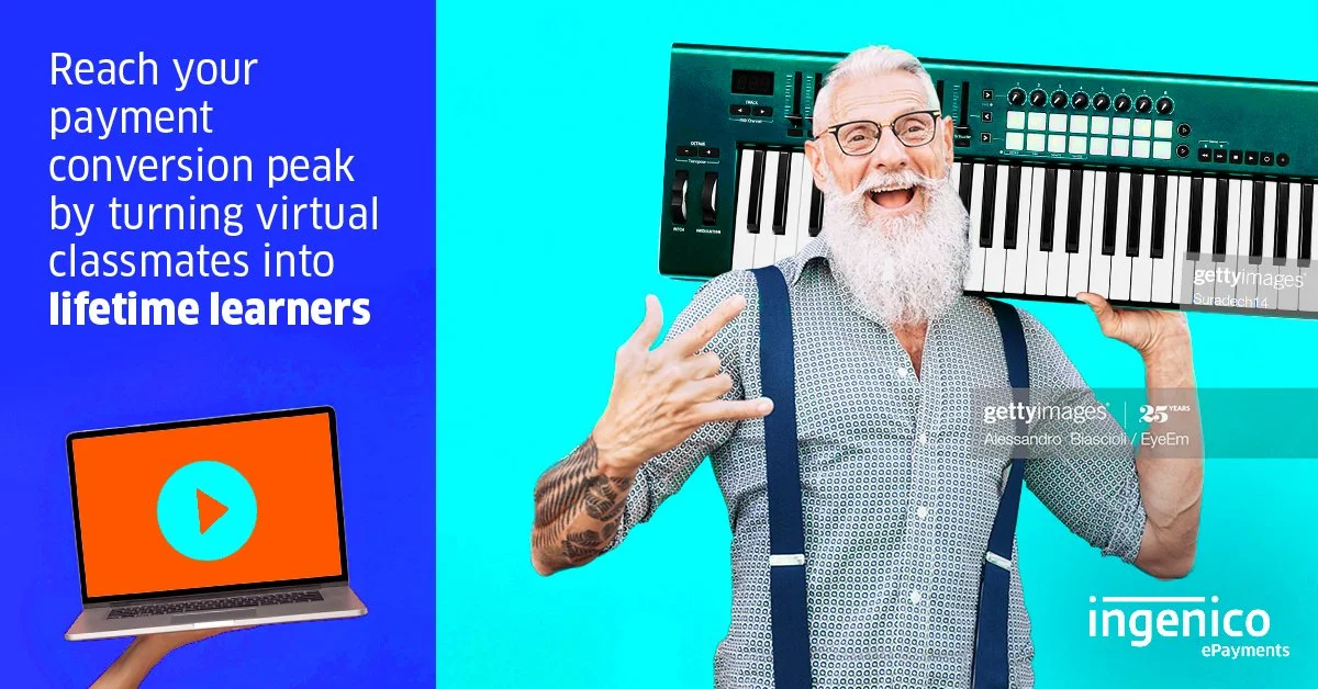
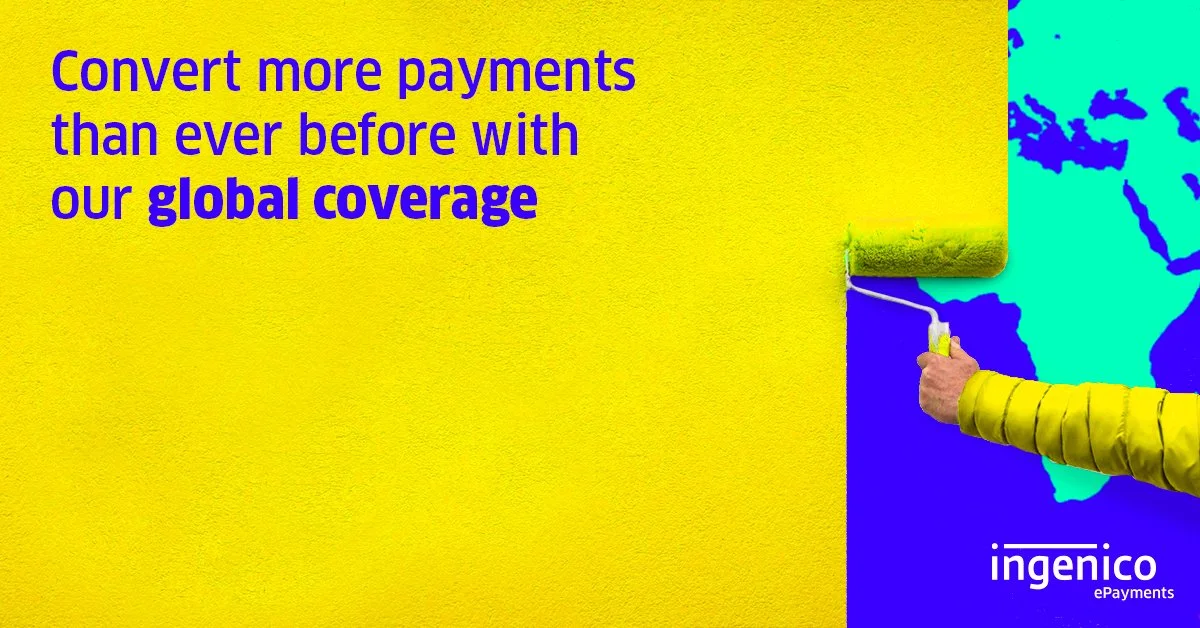
Time for some more client feedback
“Love the literal, tongue-in-cheek vibe of the route and the bold colours but we want to really highlight the ‘peak payment conversions’ headline more”
Step 5: Final campaign
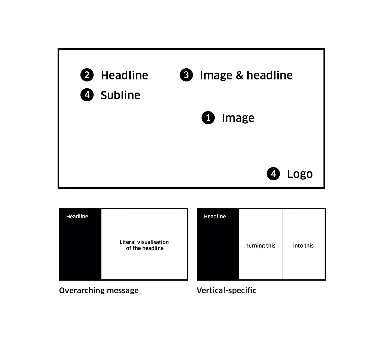
Concept mechanics
Visual anchors
Image: The first impression will be made by the image
Headline: The second thing we see is the headline (largest text)
Image & headline: The third thing we see is the combination of that first or largest copy and the image
Subline & logo: The last thing we see is the subline and sign-off (logo)
A successful layout will make use of these anchors. We need to create a story which the viewers can see themselves between these 4 points. They need to have an ‘a-ha’ moment as they connect these dots.
Social flashcards - overarching campaign
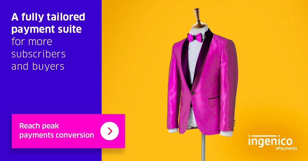
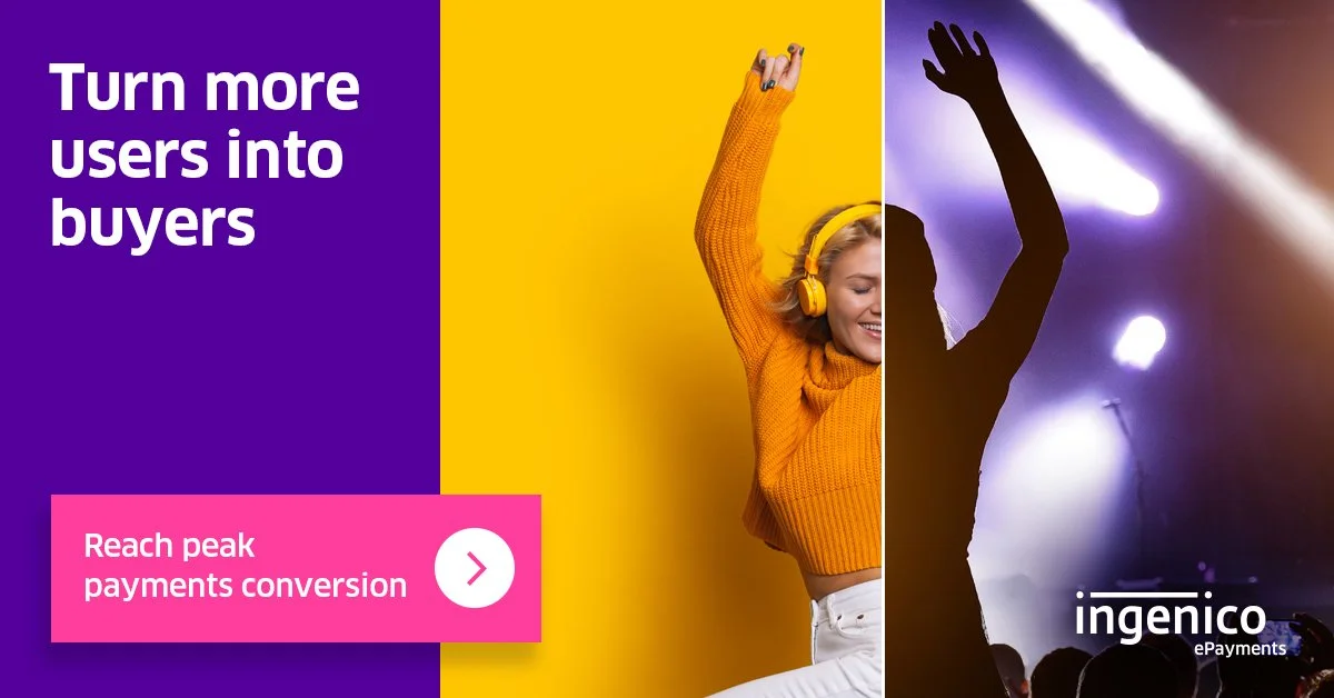
Social flashcards - vertical specific
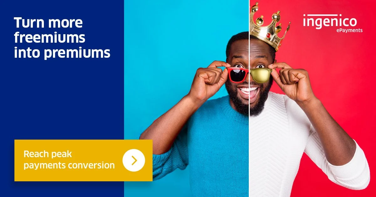
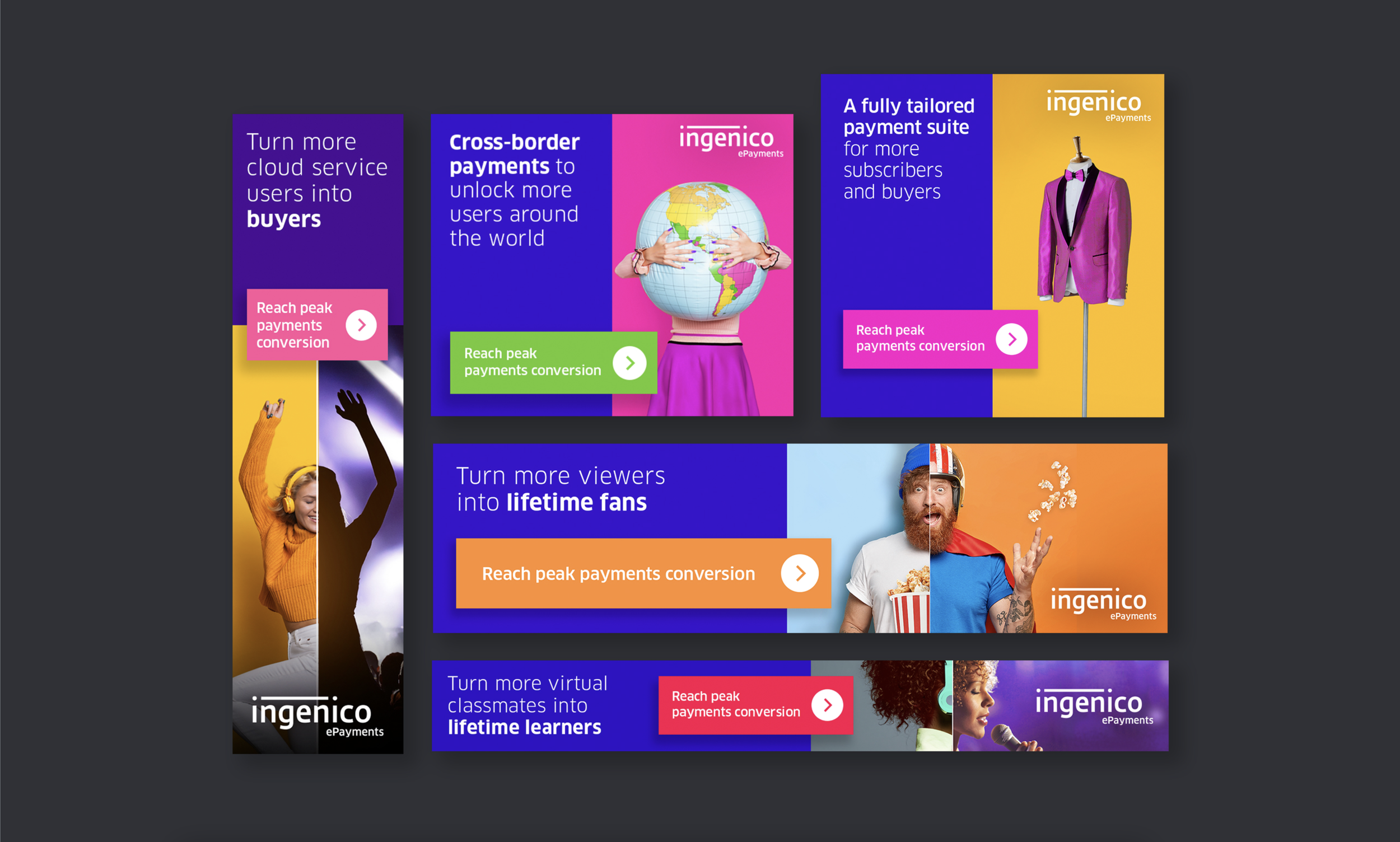
Banner ads
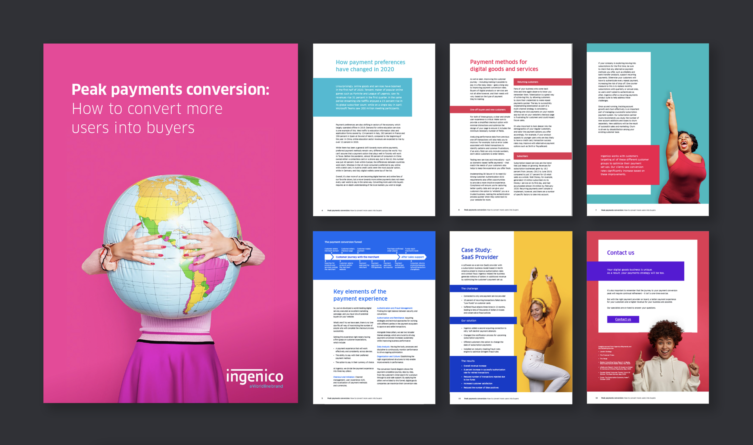
Solution paper
Web page
Well done for making it this far!